Although different film magazines have different audiences, they all consist of the same conventions and they follow a stock format. Magazines are known to follow a specific house style which runs through all their issues. This house style includes the title of the magazine as well as other features such as the masthead, the strap line etc.
After doing research on magazine covers for a specific area, in this case film, I have found that magazines use still shots taken from the film itself. However, pictures taken aside from the film are also used, for example, pre photo-shoot of the characters. Something I have seen magazines to a lot is making images look 3D, almost as if they are coming out of the page. This technique is used to attract as much people as possible and is achieved by the making the image overlap the title or other pieces of text.

Harry Potter:
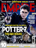
An example of a 3D image used in a magazine, is the one to the right, of Harry Potter. The magazine is Empire magazine. In this case, Empire magazine have decided to take a still shot from the actual film and they have used the main character 'Harry Potter'. This is a good technique to think about when doing my magazine cover for 30.10.10 as it will give people an idea on what the film is about and invites them into the magazine to read more. Possible find out reviews and such. The magazine have emphasised mostly on the pictures and the film, but also the name of the magazine which is written in block red letters.
I looked over many magazine covers but I really like the style 'Empire' magazine have used and I would like to base the magazine cover for 31.10.10 around this idea. I think the 3D looking image is a good way to draw potential audience in to read about it, find out reviews, a little bit on what it's about and possibly interviews by the directors or characters.

No comments:
Post a Comment