Thursday, 16 December 2010

Evaluation Question 4

How did you use media technologies in the construction and research, planning and evaluation stages?

Throughout the research, planning, production and evaluation stages of our film publicity campaign, we used many different types of technology. Technology has played an extremely important part in the coursework as it has helped me develop greater skills. This has shown through in my blog and the final trailer.

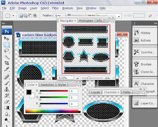
The media technology I found myself using the most was the Mac computers in our media department, as a form of computing during the production of our work. We used Mac computers as they enable us to use programmes and software that would not be available on other types of computers. Macs provided us with much software including Photo-shop that was used to create a magazine cover and poster. Photo-shop has a wider range of tools available when editing something; it produces the best finish result and shows my skills. Windows Microsoft Power Point and word were not used that much, however I still used them at times. Both of these universal software’s were used at different stages from evaluating to analysing. When used they were very useful and they added to the different variety of software used.

Magazine & Poster created on Photoshop (links below) as well as this – the horror title designs-http://naresaazemi.blogspot.com/2010/10/horror-title-research-for-our-concept.htmlsaazemi.blogspot.com/2010/10/horror-title-research-for-our-concept.html

For the research and planning stages we were glued to our computers/laptops as we got into the habit of blogging on a daily basis, for at least 30 minutes. In order to collect some of our research we used the Internet. This was a huge advantage as we were able to research into the horror genre as a whole, specific horror movies which we wanted to base our film around and lastly all the different conventions of horror film, including sound (music and sound effects), props and settings. We also used the Internet to do a lot of research into synopsis’s, film posters, magazine covers, trailers and teaser trailers. For all of these, we evaluated them which helped us clearly see the step-by-step things we will need to consider in order for our final product to have a professional and realistic finish, however keeping it innovative was always kept in mind.

Link back to blog for Magazine Cover: http://naresaazemi.blogspot.com/2010/11/magazine-cover-301010.htmlot.com/2010/11/magazine-cover-301010.html

Link back to blog for Poster:

http://naresaazemi.blogspot.com/2010/11/magazine-poster-for-301010.htmlcom/2010/11/magazine-poster-for-301010.html

Use of Slide share to create evaluation for Magazine Cover: http://naresaazemi.blogspot.com/2010/11/evaluation-of-movie-magazine.htmlml

The structure of our finished products such as the poster, magazine cover and synopsis was easy to conduct because we had the examples from the internet; however everything they consisted of was original and our own work, including the images. In order to grasp onto professional trailer-making skills I analysed many different trailers including Harry Potter and the Deathly Hallows, Scott Pilgrim vs. The World and Paranormal Activity. This helped us get an idea on where to start with the production of our teaser trailer.

The Internet was also very useful for us as there was a number of Internet websites we had to use. This included You Tube, as we had to find previous trailers and teaser trailers in order for us to share them on our blog and analyse them. This was helpful for my groups trailer because it gave us ideas on what we should do. Other websites we used was Prezi to make different creative slides to get our point across in an interactive way, as well as this we used Slide Share to upload any presentations we made on Microsoft Power Point– Slide Share was very easy to use because all we had to do was upload the video and embed it to get the html code for our blogs. Below I have inserted links back to my blog to show where I have used the websites mentioned above:

http://naresaazemi.blogspot.com/2010/10/props.htmlpot.com/2010/10/props.html - Props Prezi

http://naresaazemi.blogspot.com/2010/12/storyboard-2.htmli.blogspot.com/2010/12/storyboard-2.html - Storyboard - Slide Share

http://naresaazemi.blogspot.com/2010/10/concept-of-horror-film-music-sound.html - Music Clips for American Psycho and Friday 13thYou Tube

Another important piece of technology we used was a Sony handy cam, without this we would have not been able to film our trailer. Our Sony handy cam came with a tripod that was used whilst filming to keep our shots steady, where appropriate. We also used a digital camera to take images of anything we produced in class; we then transferred the data onto the computers and uploaded the images onto our blogs.

http://naresaazemi.blogspot.com/2010/11/evidence-of-production-work.html - Images we took on the day – Sony Handy Cam

After this, we had to edit the shots we filmed, put them all together and constructed an excellent teaser trailer for our film called 31.10.10. I chose to use Windows Movie Maker because it’s easy to use and navigate around, it has a range of transitions, allows you to add images as well as video, it separates the video and audio for editing and you can add music to the project too.

Overall, media technologies were consistently used throughout the construction of my research, planning and evaluation stages. I used the Internet for a lot of research, used it to update my blog entries, and used the Mac computers to use all the different software’s and the portable technology such as cameras to film our actual trailer.

Evaluation Question 3

Thursday, 9 December 2010

Official Teaser Trailer for 31.10.10

Below I have inserted the official teaser trailer for 31.10.10 - after all of our research and planning and audience feedback, we managed to create a teaser trailer to the best of our abilities:


Wednesday, 8 December 2010

Magazine Front Cover Analysis

Below I have inserted our front cover magazine analysis. We have annotated all the different conventions, mentioned all the different styles used and why it is useful for the reader that they are there:

Tuesday, 7 December 2010

Media Technologies

Below I have shown the logo's of all the different media technologies we used throughout the research & planning and production of our film publicity campaign. All the types of media technologies have repeatdly been used and they are all shown in my blog. Media technology has proven to be a very important aspect as none of the production work or research & planning would have been possible without it. I have inserted the image of the logo's below:


Sound Editing

Throughout our editing, we had to find the right music and sound effects to include in our trailer. All the music had to be non copyrighted. The sound effects were found on www.freeplaymusic.com - Once we found all the right sounds we edited them into the background music which was an instrumental made by a friend of ours. Me and my group found that it was quite difficult to find sound effects such as heavy breathing and loud thumps which we needed to use for when our protagonist throws a black bag with a dead body on the floor. This was a significant sound in our trailer as the thump is used to scare the audience. However, eventually we did find the sounds and we incorporated them into the trailer. The background music instrumental we used was slightly faded into the background so that it was still easy to hear the dialogue. The background music is called 'The Relapse' and it consisted of strings and piano's which created a very scary/horror like atmosphere. A back beat was also added in order to give the music a more conventional twist.

Production Details

We constructed a presentation displaying all of our production details. The presentation outlines how we created our production details and what software we used to do so:

How has research informed the planning of the groups film publicity campaign?

Above I have inserted a reflective summary of how research is informative of planning my concept.

Storyboard 2

Below is a presentation displaying a storyboard wit the new shots that took place when we went to shoot our trailer. When we filmed for the first time on the 27th of October, we realised all of our shots were too dark which meant we had to shoot again. On the next day of filming, we followed our storyboard but we then decided we wanted to add in some new shots which is why we have created another storyboard.

Wednesday, 24 November 2010

Evaluation of movie magazine

Magazine Cover - 30.10.10

We created a magazine cover to promote 30.10.10. The magazine is called backstage and in another post I will upload a slideshow which we produced to show the step-by-step guide on how we made the magazine cover. I have inserted our official magazine cover below:

Magazine Poster for 30.10.10


This is our official magazine poster for 30.10.10 - We decided to use photoshop to produce any posters/magazine covers as it has the best finish results and all the available tools we need.

Poster Draft for 30.10.10

We produced another poster we made in order to have more choice when deciding what our final product would be. We decided to use the other poster as it looks more creative and captivating. I have inserted the draft below:

Tuesday, 23 November 2010

Storyboard - Shots for Trailer

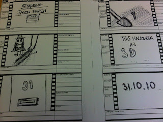
Below is a print screen of our storyboard. The shots in the story board illustrate our concept very well:

  • The first shot is a typical way to start a trailer as it displays the main character 'Jason Shrew' a star. This is a good way to start the trailer as it invites the audience in with a familiar name. This shot is filmed as a close up of the clapper board and the voice over says take 1, the camera then zooms out and the audience see 'starring Jason Shrew'.
  • We then go straight into the film with the second shot of a huge spade and a hand sticking out of the dirt. This is very effective as it immediately tells the audience the film is a horror and people get killed. It already leaves them waiting for the film as they want to know who is holding the spade. The camera tracks this shot as it follows exactly what the spade is doing. The voice over introduces the film a bit more by saying 'In a nice town, we find horror. A vicious killer and then sound effects of the spade digging.
  • The next shot is an image of a child dressed up with her halloween witch outfit. The shot is closed when the screen is covered up with a huge saw (3D effect) - Sound effects in background, possibly a sharp knife sound.
  • The 4th shot invites in our amazing Unique Selling Point 'This Halloween in 3D'. This is effective when trying to sell a movie as 3D movies have become increasingly popular. The voice over will say the line in a deep voice.
  • The next shot is very significant as it is a door with number 31 on it. The camera will slowly move towards the door and zoom into the number 31. This is an important shot as it will introduce the main location where all the horror happens.
  • The next shot is '31.10.10' which is just advertising the name of the film to the audience. The voice over will say 'Embrace yourselves, 31.10.10 coming soon to a cinema near you!'.

  • The first shot on the second part of the storyboard will display all the production details which we will write about in further detail.
  • The second shot introduces house number 31, it's going to be an establishing shot of the town and then the camera zooms in until it gets to a straight shot of the house. The shot is simply to introduce where all the action will take place again, it shows the audience it is somewhere significant in the movie.
  • The third shot will be voices of children having fun and laughing whilst trick or treating on Halloween. This is used to show the audience the movie is filmed as the day of halloween and it will involve children.
  • The shot after that continues the previous shot...
  • The fourth shot is a child in his Halloween outfit outside door number 31. Voice over 'What happens next'...
  • Last shot gives the audience a temping taster of two hands pulling the young boy into house number 31. We don't see a face or anything, just the hands. This leaves the audience wanting to know more which is why they will go and see the movie. Voice over ends the trailer with '31.10.10 3D, don't miss out on the most gruesome movie of the year'.

Storyboard - Animatics

Even though I have already analysed the storyboard in an earlier post, I have used another technique to analyse it as well. I have used the animatics technique as it is more interactive and technical. I then used slideshare to to create a slide show. I have inserted the animatic storyboard below:


Evidence of Production Work

We produced a presentation on Flickr in order to show all the work and health and safety which took place on the day of filming. As well as filming we captured moving images as well as still images. For each picture, we have included a brief description - to view the description view the slide in full screen and click on 'show info'. I have inserted the slideshow below:


Thursday, 18 November 2010

Audience Feedback - Graphs

We put the results from our questionnaires onto graphs so that we could see an overall view of what our audience think. I have inserted some of the graphs below:


Audience Feedback - Questionnaires

Wednesday, 17 November 2010

Final Title

Below I have inserted a print screen of our final title idea. We already changed our name from 31 to 31.10.10, however now we have also changed the style and colour of the writing used in our title for 31.10.10 - this is because it goes very well with the our poster and magazine cover. We also think black and red suits the concept of the film trailer a bit better.

Tuesday, 16 November 2010

Filming Day - Take 1

The first take for filming took place on the 27th October 2010. We decided to have a go at shooting in my garden as it is very big, loads of trees and there is huge converted court yard which I thought could work quite well to give it that scary feel. The arrangements were to meet at my house at 18.00. Once we got to my garden, shots were taken of all the actors in character. Their pictures were taken all over the garden with all the right props.

Once we started filming shots for the trailer, we realised it is essential to have a bit more light as it was very hard to see the shots on the camera. It was then decided to relocate because of the lighting situation. 

We then shot at Asma's houses on a later date, during the day. We filmed the rest of the shots in her garden and got some very good results as the lighting was much better this time. 

Shooting Schedule

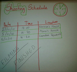
Today, we have also decided that we to shoot our trailer. We have carried out a substantial amount of research and planning which has helped us gain our understanding of the horror genre and trailers. The date we will start shooting our trailer is on Wednesday the 27th of October 2010. We have all decided on our Location. The trailer will be shot at one of the group member's house and garden. We have decided on this location because our synopsis is all about a man, who steals kids on halloween and makes them play horrifying and gruesome games with him inside his house. The garden will be used as a burial ground where he digs up holes for the children. We are going to film after 6pm when it starts to get dark as this gives the trailer that full horror effect and keeps the audience more alert, feeling like they need to keep their eyes closed and peak through their fingers

I have inserted a copy of our shooting schedule below. It was always available for me or my other two group members, if ever we wanted to write down a time and date to meet or if we needed to re-schedule:

Front Cover Magazine Analysis

Although different film magazines have different audiences, they all consist of the same conventions and they follow a stock format. Magazines are known to follow a specific house style which runs through all their issues. This house style includes the title of the magazine as well as other features such as the masthead, the strap line etc.

After doing research on magazine covers for a specific area, in this case film, I have found that magazines use still shots taken from the film itself. However, pictures taken aside from the film are also used, for example, pre photo-shoot of the characters. Something I have seen magazines to a lot is making images look 3D, almost as if they are coming out of the page. This technique is used to attract as much people as possible and is achieved by the making the image overlap the title or other pieces of text.


Harry Potter:
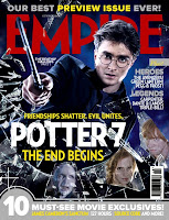
An example of a 3D image used in a magazine, is the one to the right, of Harry Potter. The magazine is Empire magazine. In this case, Empire magazine have decided to take a still shot from the actual film and they have used the main character 'Harry Potter'. This is a good technique to think about when doing my magazine cover for 30.10.10 as it will give people an idea on what the film is about and invites them into the magazine to read more. Possible find out reviews and such. The magazine have emphasised mostly on the pictures and the film, but also the name of the magazine which is written in block red letters.

I looked over many magazine covers but I really like the style 'Empire' magazine have used and I would like to base the magazine cover for 31.10.10 around this idea. I think the 3D looking image is a good way to draw potential audience in to read about it, find out reviews, a little bit on what it's about and possibly interviews by the directors or characters.

Tuesday 16th November 2010

As all my research and planning has been completed, We will now need to complete a magazine cover for 31.10.10. We will be creating the magazine cover on photoshop because it produces the most professional looking results for posters/magazine covers and w can find the right layouts and tools to use on it. 

Scripting for 30.10.10

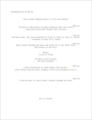
It is important that before filming you always discuss the scripting of a trailer. As a group, the scripting was discussed and a draft was drawn up. Once we got the all clear for the draft, the scripting was typed up and distributed to each member of the group. It is important to equally share out essential things to every member of the group incase anyone has any rejections etc. The script was also introduced to the actors.


Organisation of Cameras:

In order to film, it is essential that we have a proper camera with all the right equipment, including a tripod to help us capture and film shots to the best of our ability. The tripod is useful when it comes to still shots and panning. 

It is very important that the camera is kept safe, especially when filming and taking pictures. If not in use, the camera should be in its protective case. It is also important that the camera is always fully charged as it wouldn't be an ideal situation to get to the filming location and then the camera runs out. It is also important to get familiar with the camera by experimenting or just getting advice of a media teacher, incase as I said before, we get to the location and we have a problem using the camera.


Once the filming was all completed, the camera was handed back to the media department so that another group could use it. The camera was fully charged in order not to cause any delays. 


Risk Assessment

Risk Assessment for filming:

The website www.filmoffice.co.uk helped me determine what is and isn't allowed when filming in order to prevent any injuries. 

Youths under 10 were used when filming which is why it is important to to ask permission from their parent/guardians, incase of any potential hazards. I am classified as an adult, however, parents should always have full responsibility if signing a consent form. 

Produced risk assessments for the filming was looked over and signed by both parent/guardians and teachers. All hazards and control measures involved when filming were highlighted. Illustrated below is the completed risk assessment form: 

Risk Assment 1


Risk Assement 2


 Risak Assment 3


Tuesday, 2 November 2010

Target Audience Profile

  • Lady's and Gentsaged between 15+
  • Like the thrill of horror movies
  • Have allowances of £10 a week in addition to school and work fees
  • Are interested in the latest movies and trailers
  • Have a very outgoing social life
  • Come from households with incomes of £35,000+

Mike and Laura

Mike aged 16 and Laura 17 are a couple. The both of them live at home in the City of London with their families. They both live in 4 bedroom apartments. During their free time they enjoy hanging out with one another and they really enjoy watching movies together. Mike and Laura are both college students who do film studies for A Levels. This is their favourite subject as they enjoy having movie marathons and always keep up to date with the latest films. Mike and Laura both have a wide collection of DVDs that they share between them. Mike's mum is a upcoming actress, for now she works as stock characters in horror/thriller TV dramas. Laura's mum is a reporter for the online version of the empire magazine.

Research into Certification:

Our movie is rated 15+, which means that we will need to follow strict rules on what we can include. I went on the http://www.bbfc.co.uk/ website and looked at what we can and cannot include in our trailer. I have also researched what we can include in our trailer. Below I have listed a few of the following:

  • Show strong threat and menace unless sadistic or sexualised
  • Show dangerous behaviour e.g. hanging or self-harming but should not dwell on detail that could be copied e.g. easily accessible weapons should not be glamorised
  • Violence may be strong but should not dwell on the infliction of pain and injury.

As well as the above, there are many more aspects we can include in our trailer that is acceptable for a film rated 15+.

Wednesday, 20 October 2010

Initial Title Ideas and Changes

Today we had a group discussion and even though we have based all our research around our initial title 31, we have changed our idea after doing some extra research. We have decided that that we are going to change our title to '31.10.10'. All the planning and research we have carried out and blogged will still apply to our new title.
We have decided to change the name of our title simply because we though having just 31 isn't enough to excite the audience, although it represents the date halloween, we thought we could take it a step further and represent the actual date of halloween this year. There will also never be October 2010 again, so the 10 10 really has a lot of significance to the present day. It also signifies that the film is going to be very modern and will always be remembered for it's date.


Our title was influenced by other film's whose titles consisted of numbers, for example, Friday the 13th and Case 39. These numbers also had a huge significance in the film and really informed their audiences on what the film was about.

Our Horror Synopsis for '31.10.10'

Synopsis:
In a small town called Camden the man behind door number 31 isn't who the neighbours think he is. To them hes just a vulnerable man who's never had anyone but himself. On the night of trick and treats one man changes everything in the spine-tingling horror, written and directed by an extraordinary collaboration of Naresa Azemi, Rema Kadir and Asma Begum, who have all been previous award winning horror directors and writers.

The man (Jason Shrew) kills the children one by one after he puts them through a roller coaster of hell with his horrifying Halloween games that he plans all year. When a string of grisly murderes puts the town on high alert, the man dissaperas to his family farm in the countryside and leaves the parents wondering what happened on the night of celebration?

Jason Shrew had a troubled life growing up, his parents abused him, they were both alcoholics. He tried to find an escape. He attempted every possible thing in the book to be seen as a popular kid by his classmates but regardless he remained the outcast. One day everything changed. He realized that if he turned to crime and deviance he would finally get some attention. The journey to hell for many people started on that day.

The gifted cast of '31.10.10' take the audience into the mind of a very troubled man, longing for some attention and love, but he goes about things the wrong way and takes kids and families through some gruesome and chilling encounters. How many murders will it take for the parents to figure out who the killer is? Will someone survive? Embrace yourselves for this award-nominated horror movie and strap yourselves in because you are in for the fright of your life.

Thursday, 14 October 2010

Our Concept

Our Concept:

In our group, we came up with our concept which will be everything from mise-en-scene to props, plot and story line and all the other conventions we will need to include in our trailer.

We have decided to call our film 31 as it really grasps onto the horror idea as 31 is a significant date in October as it is Halloween. It is also the number 13 if you flip it around which isn't the luckiest number/day only on a Friday. Our storyline is about a man who no one sees all year round, until the 31st October, which can be no other day than Halloween. He snatches any children who trick or treat at his door and puts them through a roller-coaster of hell with his horrifying Halloween games he plans all year. He then viciously kills them but who will survive? Will he get away with his cold-blooded, sick minded games? Why does he do this? All will be revealed if you patiently wait. Embrace yourselves for an inviting trailer which will make you want to come and watch 31 at a cinema NEAR YOU!


Mise en Scene

Mise en Scene:
These are all the things that are put into the scene e.g. the setting and decor. Narrative films often manipulate the elements of mise en scene to intensify or undermine the ostensible significance of a particular scene.

Lighting:
Light effects the way colours are rendered, both in terms of hue and depth, and focus attention on particular elements of the composition. Most mainstream films rely on the three point lighting style, and its genre variations.

Summary/Plot Line and Narratives:

There are three typical horror elements found in many horror movies:

A fierce creature is the first typical element found in horror movies. A lot of movies in this genre use fierce animal to make a plot, making that animal huge, savage and intelligent can without a doubt horrify people. Using characters who are frightened all the time and are running away from the creature also excites people. These characters always succeed in escaping from some danger, but sometimes fail to escape from other dangers.

The supernatural is the second thing which is used as a typical horror element in this movie category. Supernatural things are often used to scare people and have a unique style and have become very popular.

The third horror element is murder. Filmmakers often use a scary human character to be a typical element. In some movies, the character wears scary clothes and a mask as he commits the murders. These movies nearly always start with a group of friend or people and each one gets killed until there is a revelation of the murderer in the end of the movie. During this time the audience anticipated who is the murderer and most of the time incorrect. These are also conflicts at the end of the movies, which surprise people as most conflict are related to revenge.

This helps our concept as it gives us an idea of what to base our concept around and how to go about doing that.

Tuesday, 12 October 2010

Horror Iconography and Ideology

What is Iconography? Iconography literally means image writing. For part of my research and planning, I carried out a task which involved analysing horror posters which is iconography and ideology. I annotated two posters for Friday The 13th and Devil and I have inserted two print screens below:


Props

What is the significance of props in a horror film? Without props, horror characters would not be scary. For example, try to imagine Jason Vorhees without his machete, Freddy without his claws, Michael Myers without his mask and even Jigsaw without his puppet tricycle thing. Many great horror films have a lot of memorable moments and the use of their props help to add value to their characters. It is a known fact that every killer in a horror film has a good prop beside them. However, even the normal protagonists who don't kill anyone, for example ghosts or vampires have props. An actor in a horror film can only do so much to scare the audience without their props. If Jason Vorhees stood over them looking very plain-like and shouting would not give anyone a fright. If you just add his machete, mask and ripped up clothes, you will definitely want to run away.

Don’t turn around!

This research links to our concept because our main protagonist will also have a mask which is used to add that extra horror in the film and it will keep the audience scared.